Meadowlark Dairy Rebrand
This rebrand evolves Meadowlark Dairy’s identity from nostalgic charm to a vibrant, scalable system. The new design introduces a playful cow mascot, bold typography, and expressive patterns, enhancing emotional appeal and accessibility while honoring the brand’s dairy heritage.
Package Design | Brand Identity | Illustration & Visual motifsMar 2024 - May 2024

Founded in 1919 in Pleasanton, Meadowlark Dairy became California’s first Grade A dairy, later evolving into the beloved drive‑through milk and ice cream shop that still serves the community today.


The Challenge:
The original logo evoked heritage but lacked emotional resonance and flexibility across formats. While “COWIFORNIA” and “MILK” added playfulness, the identity felt static. The goal was to modernize the brand, preserving recognition while creating scalable, emotionally engaging assets for diverse applications.
Original pencil sketches and refined digital logos
The Process:
Logo Analysis & insightsreviewed original logo and past rebranding against current food and family friendly trendsExplored mascots, patterns, and typography to strengthen emotional connection and clarityUsed informal feedback to refine standout elements and guide improvements

The Previous Results:
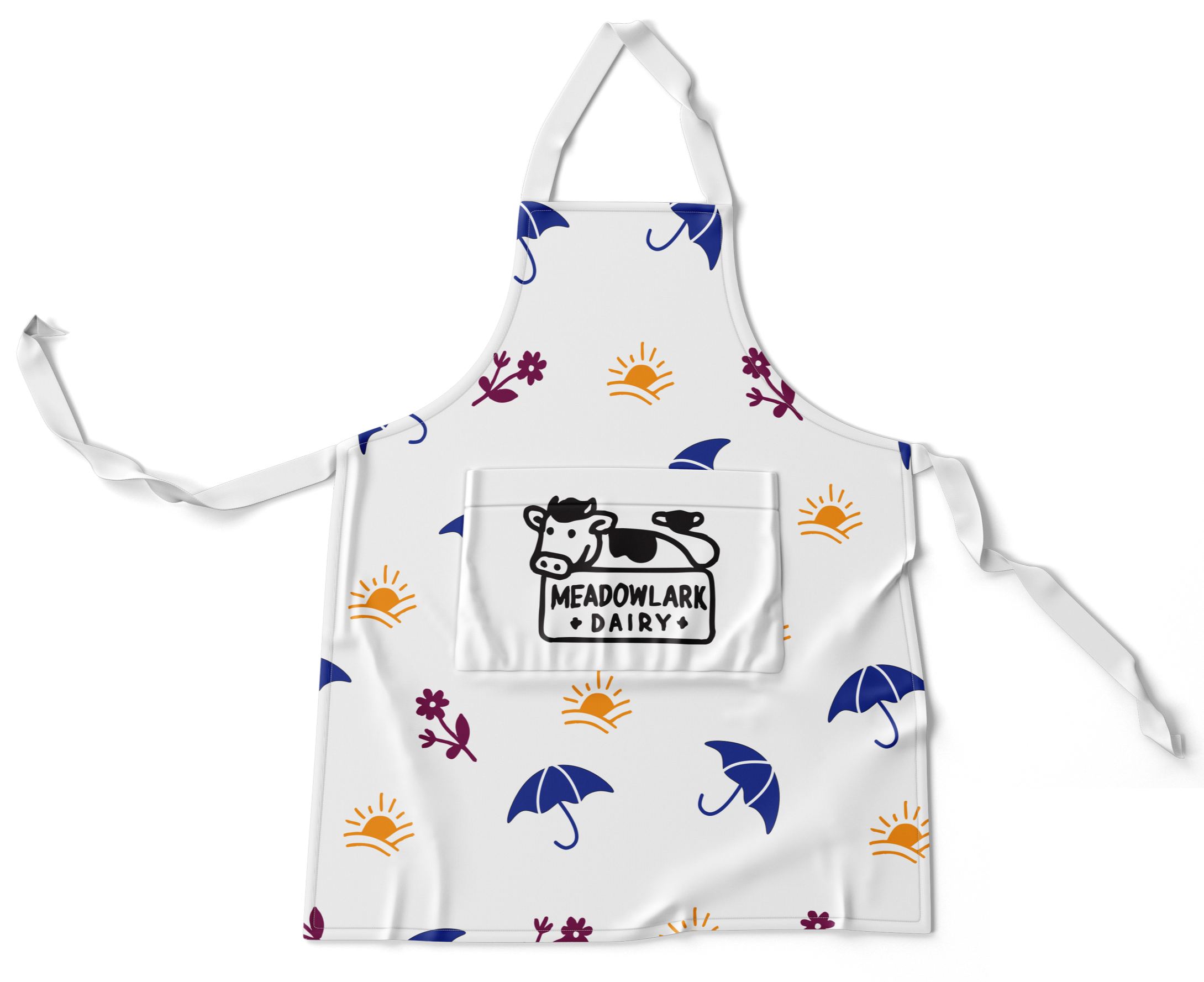
The refreshed identity centers on the new bottle logo, which celebrates Meadowlark Dairy’s playful spirit and dairy heritage. This bold, modern mark anchors the brand system, supported by vibrant typography and a cheerful pattern set.


The New Results:
After revisting the logo design and brand identity, the cow mascot was introduced to create a more engaging and flexible brand logo to tie in the original logo of the brand. Unlike the original illustration, the simplified cartoon style adds warmth, personality, and adaptability, making Meadowlark more memorable across packaging, merchandise, and digital touchpoints.
Brand Assets